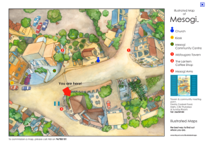
Designed by James Box. Original image can be found here.
Category: Information Design
Map illustration_ information design
Interesting Info Design
I thought this information design was interesting in the way it was designed. The use of color and the position of the information allows it to stand out among other designs. The bold black letters bring the audience in and the small colorful font and its placement around the bold words makes you want to look closer to see what it is they are trying to tell you. To see this design and more visit: http://tophersinteractivedesignblog.blogspot.com/2009/03/information-design-showcase.html
Sitting in Lab 321 is Killing You!
When looking for an example of Information Design, I found this infographic. I felt a connection to because I spend so much time working in the lab. It make excellent use of a limited color palette, consisting of red, orange, white, and black. It is loaded with tons of information and data that is important to your health. After reading this, you should get up and stretch.
Information Design
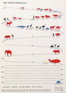
How long do animal live?
I think this one has interesting topic that talks about lifetime of animals. It’s simple so it is easy to figure out. Designer put the year on the side, and divided species by colors. It’s very organized, even if various animals are showing here.
I don’t know who made this, but date is originally from Field Museum of National History. If you want to know more information, click here : http://www.informationisbeautiful.net
Are you carrying? Are they?
Information design is a growing field becoming more and more popular as visual technology increases. In order to get a message across or describe something visual messages are becoming the norm. Such as this one.
This piece of information design shows you how to tell if somoene is carrying a concealed firearm. While in most areas the of the country this doesn’t seem like a big help, it is a very good descriptive way to showcase the information they are trying to get across.
twenty things worth knowing about beer.

One of my favorite websites is called The Oatmeal. Featuring entertaining comics and blogposts, creator Matthew Inman succeeds in making his point clear with every post. Topics range from cats to grammar to technology issues, all presented in a hilarious manner. This graphic is informative on the production of beer while providing humorous quotes from an array of figures. His illustration style is lighthearted and consistent, and I continue to check back often for new pieces. Many of them are especially relevant to designers, and I seriously embarrassed myself laughing about the “8 Websites You Should Stop Making” comic. Enjoy!
Information Design
This well-done inforgraphic is designed by Timm Kekeritz, and he created a set of infographics, visualizing parts of their research data, to make the issue of virtual water and the water footprint perceptible. It is designed by only two colors tho it descrives the main point perfectly. Also, you can get a print and download via iTunes on their website; http://virtualwater.eu/
Largest Bankruptcies in History : Info Design
 An information design that I thought was both clever and efficient in providing information was this design on the largest bankruptcies in history. It is a witty way to show “bankruptcy” as capsizing ships, yet works as a strong and readable information design. I’ve done some research, and from what I understand this design was done as a collaborative work by GOOD and Always With Honor. There are many more cool designs like this at their site.
Check them out at alwayswithhonor.com


You must be logged in to post a comment.