This is a well done infographic that’s also quite horrifying for the vast majority of us that sit most of the day. Check it out: http://www.geekosystem.com/sitting-health-dangers/
Author: dplows
Papercraft John Deere Tractor – by Structural Graphics
The video pretty much explains how effective it is. Being a papercraft artist myself, I was intrigued when I came across an article over the summer that explained this whole concept. The sculpture itself is something interesting that people keep around and show others as a conversation piece and handing down to kids to play with, which is always great in the company’s eye for many reasons. First of all, something this unique is going to be looked at with extra attention and not immediately thrown out like most ads in the mail, which should always be the number one priority by the design team. Secondly, by keeping it around and/or handing it off to someone else, the company gets more and more exposure which is great for obvious reasons.
Once the customer is immediately interested by this sort of promotion, they’re more likely to look into the company’s product further. In this case, pop in the USB stick to their computer and check out the ad.
Rehab First – Ambiguity
This logo, created by Siah Design, is effective for several reasons. First of all, it’s a classic example of ambiguity between positive and negative space with the health cross created by the space in between ‘r’ and ‘1’, which represent ‘rehab’ and ‘first’ respectively (somewhat intuitively). This is logo is also great due to the emphasis on the word “first” within the type. Of course, this helps the viewer easily separate the 2 words so that it doesn’t appear as one word; however, it also helps display the company’s values of “putting their patients first” in a very simple manner.
Much less noticeably, Siah Design very subtly made the health cross in the logo slightly (10%) longer on the bottom, to have a slight, almost hidden, emphasis on Rehab First’s (located in Texas) strong belief in Jesus Christ.
Clean, Effective Identity
This identity, created by Why Not Associates, is an example of clean and effective design. There’s always appeal in a logo that has multiple meanings. Obviously the ‘Q’ in ‘Square’ is being replaced with a square itself, but it also serves as a quote bubble graphic which insinuates conversation. This accurately depicts the purpose of the brand because it’s actually hosts meetings. Simple design like this become versatile as far a color schemes are concerned, as you can see in the image above.
The Designers List | An AWESOME Resource
Not sure how many people know about this, but it’s truly a valuable resource. If you’re a designer, this is definitely a bookmark! Basically, it’s just a list of great sites that offer fonts, stock photos, texture packs, color schemes, brushes, vector graphics, and even just inspiration. They also provide a few useful infographics such as Color Theory.
Be sure to check it out.
Humorous Information Design
Although this site is mocking the design of particular information graphics, I feel it’s useful to remind us that images can be interpreted multiple ways. We need to take all possibilities into consideration and make sure our true message prevails.
Enjoy!
First Human Spaceflight Infographic
Clever Design
Neville Brody | Typeface Designer
As I researched Neville Brody, I noticed that the hot topic was his font designs. I checked them out and there’s some really interesting typefaces. I particularly enjoy his clean sans-serif fonts, especially Insignia and Industria.
If you looking some unique typefaces to use in an upcoming project, he’s designed quite a bit that are definitely useful and will “pop” without looking too crazy. You can check them out at MyFonts.com
Graphics For Change | Emek
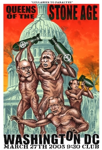
Emek’s style instantly stood out when I walked in the gallery. His images are often very detailed have powerful messages. This is a poster done a few years ago for “Queens of the Stone Age”. Although it’s advertising for a band’s show, it’s certainly expresses a strong viewpoint of our government.
Right away, you can see that the politicians are shown as “dumb apes”. The peace signs on the missiles are intriguing. (A great poster already, it caught my eye and influenced me to examine further.) At the top it says, “Lullabies to paralyze”. This confirmed my assumption that the peace signs on the missiles are describing how the white house will tell us everything that we want to hear and promise peace, but they just cause more destruction and peace is never achieved. Even simpler, they label harm with “peace”. The missiles don’t necessarily have to be literal either, such as war. Simply think of the missiles as their solutions to issues and the consequences involved. Emek did a great job (to say the least) depicting that concept. More on this topic can be found here.
As far as the layout of the poster and such, I really enjoy how the type is involved with the characters by the ape grabbing the O. Not sure if that letter has any significance? If you figure it out, let me know. Emek also keeps your eyes moving throughout the poster with the use of color, implied motion of the apes as well as their negative spaces between them.


You must be logged in to post a comment.