I think that it is beneficial for anyone who is interested in graphic design to check out http://www.logodesignlove.com because it is a website that is devoted specifically to the design of logos and brand identities. You could also check out a printed book version of logo design love which serves the reader as a guide to creating iconic brand identities. The author of both the website and book is David Airey, a graphic designer from Northern Ireland, and he updates the website at least once a week with features, news, and opinions.![]()
Author: testerokayitsatester
Continuously expanding.
Portfolio Open
http://www.portfolioopen.com is a free website dedicated to anyone who wants to start an online portfolio. The advantage of this website is that it’s easy to use. You can use an existing domain name, customize the appearance with basic CSS, or even create your own theme. There isn’t any HTML or programming involved so you can start the portfolio at anytime!![]()
Photoshop Brushes
http://www.brushlovers.com is a very useful website where graphic designers can get unique photoshop brushes. While on the site, a designer can browse through the brushes and enjoy both free and premium styles. The brushes on this website are in high resolution and can be used for both personal and commercial use. The image displayed is an example of a premium brush called “Paisley”. It’s only $3 and can be changed with as many colors, hues, or effects that anyone could want. Another cool feature on this website is that you have the ability to purchase packs where you will receive the best deal. For example if you purchase a 10 brush set for $12 you can choose 10 different brushes that would originally cost $3 each. This is a great deal for any designer and I highly recommend usage of this website.
www.mycroburst.com
http://www.mycroburst.com is a website where people in need of a logo, website design, or design of any kind can go and it’s also a place for designers to work. If you are joining the site as a customer there is a listing fee of $19 to run your contest and you will need to enter a prize for the winning designer at a minimum of $149 depending on the project. If your a designer joining the site there isn’t any fee and you can explore the contests and design as much as you’d like. This website is successful because each contest gets designs in a matter of hours and select designers can win prize money while building their portfolio.
The image below is an example from a contest listed for a real estate logo. This logo hasn’t won the contest because there is still a few days left running, but it’s a good example of what you would be receiving design wise if you were to sign up as a customer. This designers user name is niklaslffedesign.

Self Promotion – Chris Piascik
This is an image of the graphic designer’s array of business cards. His name is Chris Piascik and his online portfolio/website is http://www.chrispiascik.com. I chose Chris’s self promotion business cards because unlike the standard, boring card, Chris’s business card’s are fun. There is an interesting typeface and bright blue color which I love. If I was in need of a designer I would most likely choose a designer with a fun business card like this opposed to a more serious one. This is because it shows creativity and originality and I would want the same in my design or logo.

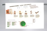
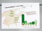
Coffee
This information design was created by Kelly Holla and can be found at http://www.kellyholla.com. I think this design is interesting because Kelly illustrates the amounts of waste that is produced by the coffee industry and Starbuck’s attempt to fix the problem. I like the idea of this information design because I personally would have never thought about the waste from the coffee industry. Sometimes these things need to be brought to our attention.


Lady Rocket
This logo was created by a user called Logomotive on the website http://www.logopond.com. Logomotive’s designs are found at http://logopond.com/members/profile/showcase/679
This logo is a good example of positive and negative space because clearly the image is both a lady and a rocket. I believe that not only is this logo well created because of the positive and negative space, but also because it’s so simple and easy to interpret.

Got Milk?
 I’ve pretty much seen this “got milk?” image ever since I was a little girl and it never really phased me to think about who designed it or why. Well, the advertising agency Goodby Silverstein & Partners, located in California, created this as an advertising campaign to encourage people to go out, buy, and drink more milk in 1993. They did this because when you really think about it, there isn’t true brands for milk. If someone asks you what kind of milk do you drink, you’d say something like, “The Red Kind” or “2%”. When the designers at Goodby Silverstein & Partners gathered to think of a campaign, they had a board of ideas and the head of the board was labeled Got Milk. One of the designers suggested “got milk?” to be the head of the campaign and at first the other designers were unsure of the idea. They argued that “got milk?” wasn’t really even english and that it didn’t make sense. But the longer that they looked at “got milk?” the more they realized that they had something great on their hands. While now “got milk?” is a nationwide known advertisement, it was originally meant for the California Milk Processor Board. It’s interesting to know that something meant for California had been spread nationwide and has even had parodies, imitations, and merchandising based off of what was at once, an unsure idea.
History of Graphic Design – Herbert Bayer
 Something important to know about Herbert Bayer is that he designed the “Universal” or “Bayer Universal” typeface in 1925. This sans serif typeface consists of both upper and lowercase letters in a single character set.
On a more interesting note, Herbert Bayer was the art director of Vogue magazine in Berlin, Germany. He once designed a brochure for the Deutschland Ausstellung, where life in the Third Reich as well as Adolf Hitler were celebrated. Then in 1937 His works were then placed in the Nazi propaganda exhibition called “Degenerate Art”. The following year Bayer left Germany and moved to New York City.
Graphics for Change – Emek
 When I viewed the paper ink {voice} exhibit I really enjoyed all of the artists’ work. There was however one artist who’s work really interested me and I liked the style of all his pieces. This artist was Emek and I really enjoyed his blunt, straight forward, creative work and message. So when I got home I decided to google more of his works and I stumbled upon his website. http://www.emek.net.
The image to the left is a piece that Emek created to help victims of Hati. The artwork is 18″ x 24″ done in silkscreen. The profits from these pieces that Emek has sold went straight towards Hati. On his website, Emek had said that the first batch of these posters had raised $24,000. It’s really nice to see an artist make an informitive poster and sell it for profits towards the issue at hand.
I look forward to seeing future artwork done by Emek.

You must be logged in to post a comment.