CD package that is done by Thomas kohl without glue.
Author: ans81
Michael John Nurczynski
print design
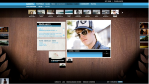
Carbonmade
These designs are done by Chelsea Conboy.
portfolio website: Carbonmade http://carbonmade.com/
With Carbonmade, you can manage your online portfolio with a variety of tools that allow you to change how you display your work. The core idea behind the design of Carbonmade is to keep your images or videos at the forefront.
After joining website you could be allowed to upload your portfolio or work and to do comment to other’s work.
Those designs are done by Fresh ideas company
http://www.flickr.com/photos/freshideascompany/4763801750/in/photostream/
http://www.flickr.com/photos/freshideascompany/4764912342/in/photostream/
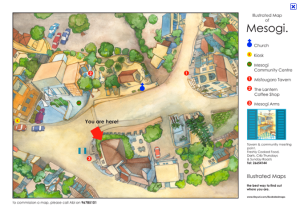
Map illustration_ information design
Hilppa hyrkas_paper ink
(In the paper ink, Hilppa hykas’s work is Stop Climate Chage.)
This poster is about saving the Baltic Sea. Comparing with ‘Stop Climate Change’ this poster is done differently. The artist used photo and simple sentence that can emphasize what artist want to say.
Milton Glaser
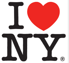
Milton Glaser created the emblem “I love New York” with a red heart for “love” for the 1973 New York City tourism drive. It is probably the most copied and varied graphic idea in the world. In 1984 Milton Glaser designed the poster for the Sarajevo Winter Olympics.
@font-face { font-family: “Cambria”; }p.MsoNormal, li.MsoNormal, div.MsoNormal { margin: 0cm 0cm 0.0001pt; font-size: 12pt; font-family: “Times New Roman”; }a:link, span.MsoHyperlink { color: blue; text-decoration: underline; }a:visited, span.MsoHyperlinkFollowed { color: purple; text-decoration: underline; }div.Section1 { page: Section1; }
starbucks
Starbucks was designed by Terry Heckler of Heckler Associates. This logo represents mermaid.
The re-design was carried out by international branding firm Lippincott.
New Starbucks logo design is more simple, and it has more technique of ambiquity of positive and negative space by removing letters around mermaid. Even This logo becomes an iconic that no longer needs a name. It shows the power of symbolism and brand recognition during 40 years.
@font-face { font-family: “Cambria”; }p.MsoNormal, li.MsoNormal, div.MsoNormal { margin: 0cm 0cm 0.0001pt; font-size: 12pt; font-family: “Times New Roman”; }a:link, span.MsoHyperlink { color: blue; text-decoration: underline; }a:visited, span.MsoHyperlinkFollowed { color: purple; text-decoration: underline; }div.Section1 { page: Section1; }
assignment3. identity_apple logo
Apple logo that was designed by Rob Janoff, and art director at advertising and public relations firm Regis McKenna.
The reason why I admire is that apple logo is simple and easy to be recognized. It makes people can remember easier than complicate designed mark. And another reason is that Apple logo is kind of iconic about taking bite out of an apple. And this inconic is that people can experience.
http://www.macworld.com/article/142322/2009/08/logo_design.html


You must be logged in to post a comment.