Anyone who really knows me knows that I am a huge Winnie the Pooh fan and I love cartoons and a lot of this has to with my interest in Disney. I have grown on many Disney classics and Disney World is probably one of my favorite places in the world. I look at their logos and it reminds me of childhood memories and all the great things that I associate Disney with. I think the logos are well thought out because they are simple but the message behind it is so huge. It show what a long way a name or persons signature goes. This is what inspires me to have a strong signature and one that reflects me because I never know where it will get me one day.
Author: tanyagill
Interesting Info Design
I thought this information design was interesting in the way it was designed. The use of color and the position of the information allows it to stand out among other designs. The bold black letters bring the audience in and the small colorful font and its placement around the bold words makes you want to look closer to see what it is they are trying to tell you. To see this design and more visit: http://tophersinteractivedesignblog.blogspot.com/2009/03/information-design-showcase.html
NBA Logos
Since the NBA playoffs started I’ve been taking notice to the different logos for the teams. I think they are creative in the way some of them incorporate the team name with what their name represents. For example the Orlando Magic with the ‘magic ball’ and the star in place of the ‘A’. I thought the Indiana Pacers logo was on the simple side compared to most but still the design works. The Michael Jordan logo is one of the most popular logo especially in the NBA. The silhouette of Michael Jordan performing one of his famous jumps is seen on many athletic gear and make Nike Air Jordan’s one of Nike’s most popular shoe.
Cool Logo
Ever since we were assigned the Identity project I became interested in the different logos that were out there. I came across this logo when I googled ‘cool logos’ and I thought it was pretty cool. I like the concept of creating words or phrases from letters, words or objects. It is a unique use of design and a logo that works.
viewbook
Viewbook is a website that allows you to put your portfolio online and work on presentations from the web and mobile. This is a great website for designers, artists and photographers. Viewbook allows for a free 30 day trial but then there are monthly/yearly prices for different packages: Gallery Basic ($4 monthly/48 yearly, Portfolio Standard ($9 monthly/$90 yearly), Website Pro $(19 monthly/$190 yearly).
Here are some examples of pieces from current viewbook users
 Hi Location (Architecture)
  Garet Field Sells (Photograher)
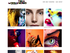
  Yulio Gorbachenko (Photographer)
Tyler Perry Studios
For the last eight years actor/filmmaker/playwright Tyler Perry has created a pretty big name for himself. He was recognized for his plays and his hilarious character Madea. With the tremendous success of his plays he was able to create his own studio, in which he names Tyler Perry Studios. This studio represents Tyler Perry in all aspects. He owns all his movies and they are all under his studio, he playwrights and directs most of the movies and appears in quite a few of the films (some as multiple characters). As well as films and plays he is also responsible for the TV series, House of Payne and Meet the Browns. He has become a well know individual in the world of Hollywood and is admired and respected by fellow actors for his work. His writing for the plays and films reflect some events and issues he had experienced in his past, and all these aspects are reflected back through his studio. I believe his studio is a perfect example of who Tyler Perry is and allows others to see who he is and what he has done.
USA Network
I find myself seeing this logo all the time, especially when I’m watching the Law & Order SVU marathon. I have always found it to be a cool design and thought it would be the perfect example of ambiguity of positive and negative space. It is clear that the there are 3 letters (U-S-A) put the negative space of the S created by the U and A is an excellent use of design. What I found interesting when researching on the logo I found that it went through a series of different logos since it’s start in 1971. Through the timeline of logos I find the current logo to be the most effective, especially when it is on the bottom of the screen while watching the USA network. I always found it annoying when a TV logo interferes with what you are watching on TV but this logo allows for the viewer to enjoying their program while also reminding them of the network their watching, where characters are welcomed!
Apple Inc.
I think the Apple identity system is very effective and recognized everywhere. The logo is very simple but works for advertising and supporting the products that Apple produce. Their products have become a huge demand that most people aspire to posses. Technology today is dependent on Apple product. Between the iPhone, iPod, iPad and Mac Computers its amazing how so much is supported by one company. Apple is the biggest competition out there, and very few can compare or come close to topping them. I always thought the concept was interest for the logo, simple but effective. First the computers were known as macintosh with the rainbow ‘macintosh apple’ but now the name has been shorten and the apple is standing stronger than ever. To learn more about the Apple company and to view some of their latest products visit the Apple Store.
Henry Dreyfuss
Not knowing who Henry Dreyfuss was when I was assigned him I was expected to find out that he was huge designer found in big name magazines. When researching him I was surprised to find that I was completely wrong. Henry Dreyfuss was a industrial designer during the 1930s and 1940s. He actually designed many things we see and know today and often take for granted. Some of his designs include the Princess telephone (1959), Hoover Model 150 vacuum cleaner (1936), New York Central Railroad’s streamline Mercury train, John Deere Model A and B tractors (1938) and the Honeywell T87 circular wall thermostat, just to name a few. He was a very important designer for his time. Many of his designs are still used today or have become the bases of the models we see everyday.
Help Mend Haiti
When observing the different posters in the exhibition I was especially interested in the pieces from the Haiti Poster Project. I liked this poster by Brittany Phillips because her use of material was directly related to the message the poster gave. I thought it was a creative concept and gave off a very powerful message. In some ways I felt as if I should contribute to the mending and rebuilding of Haiti. Unfortunately it is tragic events such as these that creates a feeling in people from all over to come together and help the victims overcome this hardship. I think this poster as well as the others gives off this feeling.


You must be logged in to post a comment.