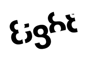
 This logo is more creative and thoughtful than many others. The designer considered everything from positive/negative space to typography. Each letter enables to viewer to see the “8” shape. It gets the message across in multiple forms and makes it more memorable for the viewer. More logos with meaning behind them can be found at http://creativebits.org/logos_with_a_meaning
- Reblog
-
Subscribe
Subscribed
Already have a WordPress.com account? Log in now.
You must be logged in to post a comment.