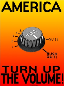
Jai Johnson_Animal Cruelty

Jai Johnson from Jackson Tennessee is uses a lot of her artwork to bring attention to the needs of animals who have been abused, abandoned or neglected.  She donates some of the money she makes off her art sales to animal rescue organizations in Tennessee.

For more information on Jai Johnson and her work visit http://www.zazzle.com/jaisjewels/about

Hilppa hyrkas_paper ink

(In the paper ink, Hilppa hykas’s work is Stop Climate Chage.)

This poster is about saving the Baltic Sea. Comparing with ‘Stop Climate Change’ this poster is done differently. The artist used photo and simple sentence that can emphasize what artist want to say.

http://www.logorevue.sk/portal/?c=18&p=5

Aids hidden danger

d

This is designed by Cedomir Kostovic. When you see this poster at the first time, you may just see lots of dots on the black back ground. However, if you take your time for a second, you will see the letter ‘Aids’. Also, in the real life, we cannot find out who has aids sickness, but they are staying around you, because they look same(same dots). So it says you have to be careful to get that disease.

Cedomir Kostovic’ website :www.cedoposter.com

Luba Lukova

After attending the paperink {voice} exhibition back in February, Luba Lukova’s art really stood out to me. Everything she does is simple and to the point in a way that is so creative; I find it so fascinating! This health coverage poster really caught my eye. She creates strong pieces of work that reflect the current issues in society today. The use of simple graphics and only 2 colors really brings the piece together. I think a key component of all graphic design is getting your point across as simply as possible. Luba Lukova definitely does that in all her work.

Emek

After Looking at all the poster, i decided that Emek has a great sense of telling information through his work.  The one which got my attention was R.I.b.p poster, it was perfectly composed and send a straight forward message.

Dead Poster

The Grateful Dead Poster which i thought was magnificent, having the eye be the center of the focal point and then all the information is inside the eye.

Valerie Miller

Bush Out
This is a political poster by Emek. I feel this poster is very straight forward and to the point. You can grasp the concept very quickly, and it certainly grabs your attention. I like the design of the poster. It is stating that the people of America need to speak out and make the government hear their voices. The more people speak out, the harder it becomes to simply ignore.

Help Mend Haiti

When observing the different posters in the exhibition I was especially interested in the pieces from the Haiti Poster Project.  I liked this poster by Brittany Phillips because her use of material was directly related to the message the poster gave.  I thought it was a creative concept and gave off a very powerful message.  In some ways I felt as if I should contribute to the mending and rebuilding of Haiti.  Unfortunately it is tragic events such as these that creates a feeling in people from all over to come together and help the victims overcome this hardship.  I think this poster as well as the others gives off this feeling.

Haiti poster project

My favorite poster was Haiti Poster project that was created by Miki Iwasaki. He has his own business, mi workshop in California. This poster really caught my eye because I could see strong his message from the simple design. It is constructed of silkscreen, wood, and steel hardware. The silkscreen is torn in two, and wood pieces bonded together like Band-Aids. I think that he put his hope of Haiti’s rapid recovery in the poster.

Emek – “Foood”

I wrote an earlier blog regarding graphics for a change, but it wasn’t quite protesty enough, so here’s a new bit about a poster by Emek. I enjoy this one because it quickly communicates a complex idea. I feel as though the visual really propels the viewer’s thoughts and forces them to question where there food is sourced from. Moreso, the graphic is rather unsettling (that fish has too many fins and its tail is obviously a corn!) and rather informative (A lot of our foods – especially subsidized foods – are manufactured and manipulated forms of corn. Check out your food labels). Recently, responsibly harvesting food has been covered more in the media, but certainly not enough. I like Emek’s work because it very openly and easily states what the viewer(s) need to understand.

Keith Haring

After viewing the exhibit – paper ink {voice}- I found that Keith Haring’s work really caught my attention.

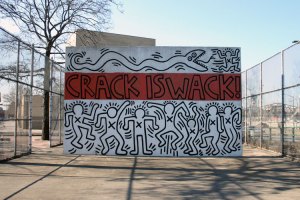
This is another piece by Keith Haring that is protesting for a cause. In this Case, he is protesting against the use of drugs. This is a picture of the piece which is seen in a park right off of the FDR Drive. Whenever I go into the city, I see this and I always remember how much I love it. The back also is another keith Haring piece that goes with this one and looks like this-

what I find to be really great about these pieces is that they are done on a cement wall in a playground. By doing this, I feel he is really trying to speak to kids.