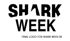
 Anyone who knows me moderately well is probably aware that I think sharks are the coolest thing since sliced bread. (However, since sharks are prehistoric creatures – therefore existing before bread ever existed – I think we really ought to be saying that sliced bread is the best thing since sharks.) When Shark Week is on the Discovery Channel during the summer, I am glued to the television. I put everything on hold (ie: the gym, work, family, eating, etc.) and I watch as much Shark Week as I can. I digress. Point being, how sweet is this logo? (And I’m not just being biased here because I happen to think sharks are beautiful). It’s straight-forward, the negative space conveys the dorsal fin without making the text confusing, and it looks nifty as an animation, which shark week used as a screen-corner “bug” to promote shark week (in the animation, the negative space of the shark literally swims through the text.)
Designed by: Kristian Mercado
You must be logged in to post a comment.