TEMPLATE FOR CD LABELS!!!!!!!

just click on this link and you should be able to open the pdf

What you will need to do is open the pdf and save it to your desktop. Drag the file into either the illustrator or inDesign icon on your computer screens dashboard at the bottom of the screen. Now it will open in the program you chose. Copy and paste your CD label design right onto the template that just opened up in either Illustrator or inDesign! Then print it out using the paper I gave you and it should work. 🙂

ATTENTION Graphic Design classmates!

I am just letting everyone know on here that I bought a pack of 50 CD labels that we will be needing for our final project. I obviously do not need all of them, s0 I am selling a sheet for $1 each. There are 2 labels on each sheet (incase you mess up on one) Please let me know if you want one!

You can contact me at chloereznikov@gmail.com. I also have class at 2-3:50 in lab 321, so you can find me there. I will bring them with me to each class we have left.

Also, heard of the Computer Art Club? Well I am Co-President of it and it is an awesome club! We have about 20 members now and I am so happy with the growth of this club. We just took a trip to NYC to visit the MoMa, and we had a group BBQ on Sunday. You all should consider joining next semester!!!! Our Facebook group page is https://www.facebook.com/home.php?sk=group_132642583468691&ap=1, anyone can join. 🙂

This is some of our club members from the BBQ this past Sunday! You all must recognize Sven….. 🙂

Job Outlook for Students like us!

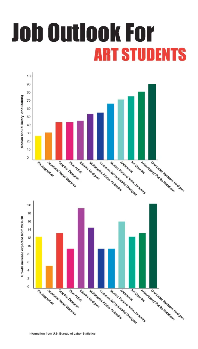
Hi everyone! This is what I did on my Informational Design project and I just wanted to share it with everyone on here! I came up with two bar graphs of information regarding the job outlook for students like us! The first graph demonstrates the median annaul salary (in thousands) for various jobs in the art field, and the second graph shows the growth increase expected to occur from 2008-2018 regarding these jobs. I found it very interesting and I hope you all do too. If you are looking to make big money, then it looks like a Computer Systems Designer is the way to go!!! The median Computer Systems Designer makes almost $100,000 a year!

ebay!

We have all heard of ebay and have seen this logo! Ebay is the most popular online auction and shopping website in which people and businesses buy and sell a broad variety of goods and services worldwide. But who created this logo that a lot of us see almost every day? There are hundreds of logos that we see every day but most people forget about the artist who came up with the logo. Bill Cleary is the man who created the famous ebay logo! He is an American entrepreneur with a background in advertising and marketing. He worked in New York advertising firms as a copywriter for several years. He then joined Apple Computer, where he worked from 1981 to 1985, helping to promote the Apple IIc and Apple IIe.

BigBlackBag

Haven’t heard of this website? Well either have I until I did some research on the internet regarding online portfolios. It is worth looking at because it is a stunning online portfolio website for Photographers, Artists, and Creative Professionals. On their website, bigblackbag.com, it states that “Over 5000 photographers, designers, and artists trust their online portfolio website needs to BigBlackBag.” Pricing starts at $8.99/month or $49/year, but nothing that is that great is every really free.

This portfolio website will get you business because it uses standards compliant HTML making all your content highly visible to search engines which translates into customers. They give you complete control over the content and metatags for each web page you create, allowing you to target the keywords that are important to your business. If that weren’t enough, they also submit your website to all the major search engines for free!

I looked at a few websites of artists that use this online portfolio website. Matt Morin works in advertising and creates designs for Taco Bell, Lipton, Jamba Juice, and many more. His work is shown at http://www.mattmorincreative.com.
Andres Razo is a photographer and I wouldn’t have found Razo’s beautiful work if it wasn’t for BigBlackBag. Razo photographs a lot of people and I just think they are really great and talented photographs. You can check them out at http://www.andresrazo.com.

Ralph Lauren

Who doesn’t recognize the name Ralph Lauren or at least his polo symbol? He did an incredible job of self-promoting himself. This logo is seen everywhere across the world; On stores, clothes, shoes, bags, bedding, towels, jewelry, perfume, hats, the internet, magazines, billboards, and etc. He got his name out there in such a simple, clean and beautiful way that once I see that little horse and polo man, I automatically know it is Ralph Lauren. He is one of the most successful and well known fashion designers in the world and this wouldn’t be so if he didn’t do such a great job self-promoting himself! Here is Ralph Lauren’s website: http://www.ralphlauren.com. View it and check out how successful this business has become!

A great example of information design!

I just love this informational design using ISOTYPE – the International System OTYpographic Picture Education. It was an early infographical form, originated in the 1930s by Austrian philosopher and curator Otto Neurath “as a symbolic way of representing quantitative information via easily interpretable icons.”  I love this design because it is very easy to read and understand due to Gerd Arntz’s pictures of animals and very thoughtful color system. It is very simple and does not throw too much information or type at the reader. The curved timeline makes this design easier to look at because it creates flow and movement in the design. The colors chosen to show if the animal is a mammal,  bird, invertebrate, or other vertebrate are drawn in all primary colors which I think is a great choice. Gerd Arntz is a very talented designer and you should all check him out at http://www.gerdarntz.org/

Mann Music

As I was doing some research on great logos that showcase ambiguity of positive/negative space, I came across this one. It is a logo for Mann Music and is designed by Nadir Balcikli. He specializes in logo’s and branding and his website is http://www.logorado.com. I admire the logo because it is very creative and thoughtful. Only dark brown (almost black) and white are used, which I love because the high contrast immediately catches my attention. When I first set my eyes on this logo, the only thing I noticed was piano keys above the words “mann music.” But after staring at it for a few more seconds, I realized that the piano key’s thoughtfully spell out “mann,” due to the positive and negative spaces. It is a simple but lovely logo and I think that it is just wonderful!

The perfect identity system for Saks Fifth Avenue!

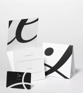
One identity system that I absolutely love is  Saks Fifth Avenue, designed by Pentagram. My love for this identity has nothing to do with my love for this store. I very much believe that Pentagram did a marvelous and thoughtful job of creating this identity for Saks. The black and white  is what catches my eye due to the high contrast! My eye then wants to keep looking at the identity due to the beautiful font that was chosen for “Saks Fifth Avenue.” The packaging for this identity is wonderful because it is a figure ground reversal. The black and white shapes create lovely positive and negative spaces that keep my eyes glued to the packaging. Pentagram did a perfect job in creating the Saks Fifth Avenue identity!

I found my information on this identity at http://www.pentagram.com. I encourage everyone to go to this website and view the many, many other incredible designs by Pentagram!

Paula Scher


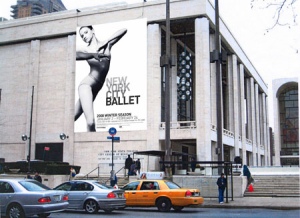
This is Paula Scher! She is one of NYC’s finest graphic designers. She is known for many identities and famous logo’s. Not only did she create the well known citibank logo as well as the Tiffany & Co. packaging, but she is also known for the New York City Ballet  identity, The Public Theatre Posters, and much more.

This  is one of my favorite Public Theatre poster of Scher’s. She is so wonderful with type and I think that this poster is just so interesting to look at due to the different size, font, color, and position of the type.

These pictures above show advertising for the NYC Ballet. I love the ballet and I was excited to find out that the designer I was chosen to research is the women behind the advertising for the NYC Ballet!

I think this women is just so spectacular! Other’s must agree because her work can be seen in permanent collections of, among others, the Museum of Modern Art, New York; the Library of Congress, Washington DC; the Museum für Gestaltung Zürich; and the Centre Pompidou, Paris.