This design makes great use of the positive and negative space in order to create the 8 fish. Upon first glace at the picture you may only see the four fish in yellow but by looking a little closer you can see the other four fish created by the negative space. This interesting logo was designed by Jerron Ames. To see more designs by Jerron Ames you can visit his website at: http://www.logofaves.com/designer/jerron-ames/
Category: Logos: Abiguity of Pos/Neg space
Share logo that you found which uses Ambiguity of Pos/Neg space
starbucks
Starbucks was designed by Terry Heckler of Heckler Associates. This logo represents mermaid.
The re-design was carried out by international branding firm Lippincott.
New Starbucks logo design is more simple, and it has more technique of ambiquity of positive and negative space by removing letters around mermaid. Even This logo becomes an iconic that no longer needs a name. It shows the power of symbolism and brand recognition during 40 years.
@font-face { font-family: “Cambria”; }p.MsoNormal, li.MsoNormal, div.MsoNormal { margin: 0cm 0cm 0.0001pt; font-size: 12pt; font-family: “Times New Roman”; }a:link, span.MsoHyperlink { color: blue; text-decoration: underline; }a:visited, span.MsoHyperlinkFollowed { color: purple; text-decoration: underline; }div.Section1 { page: Section1; }
NBC logo
 This famous logo for NBC has a peacock between the pick and purple “feathers” and is facing forwards, symbolizing the company moving forward and not backward. I think the use of positive and negative space is quite remarkable. Some more logos can be found at http://www.toxel.com/design/2010/06/09/24-cool-logos-with-hidden-symbols/
Edgeboard Logo
 This is a logo for a company called Edgeboard, designed by Hampus Jageland. I think it is a great example of positive and negative space in a logo because the way the E and B are arranged give it the illusion of a box, and it is extremely appropriate for the company’s name and product. Click on the picture to see the rest of the product’s identity designed by Hampus.
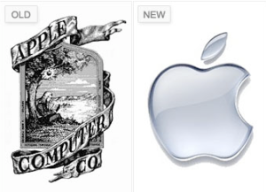
apple logo
The Left one is the logo when the apply company just came out. It looks complex, and even it’s hard to see the apple. On the right side logo is new one. It become very simple, but strong by using positive and negative space properly.
The designer who made new logo is Rob Janoff.The company website is http://www.apple.com
5.10
There are many fantastic logos that involve positive and negative space. The one that caught my eye was the logo for 5.10 the apparel company. Through clever use of positive and negative space the designer has created a single image using both the numbers five and ten. You can look at it from many different angles and each time you will see a different number of the two. 
Toblerone Logo
The Toblerone logo is an excellent example of ambiguous positive-negative space. Within the image of the mountain, a bear can be seen. At first glance, it’s hard to see, but upon closer inspection it becomes clear as day. I could not find information on who created the logo.
fed ex.

The Fed Ex logo is one we are all familiar with. We have seen it on television, in print, and on boxes delivered to our homes. However, the simple genius of the design remained unnoticed by me for years. Honestly, it wasn’t until some point during high school when I noticed the space between the ‘E’ and ‘x’ creates an arrow. Upon this discovery, I declared the logo one of the most clever things I had ever seen (though I myself am apparently not.) The design was created by Lindon Leader of the firm Leader Creative, and has won over 40 awards worldwide.
Ambiguity of Positive and Negative Space-Adidas
 Adi Dassler, together with his brother Rudolf Dassler, created the Adidas logo, aiming to provide the athletes with the finest possible gear. For years the only symbol associated with Adidas was the trefoil (flower) logo design. The 3 leaves symbolize the Olympic spirit, linked to the three continental plates as well as the heritage and history of the brand. The “Trefoil” was adopted as the corporate logo design in 1972. I think the logo of Adidas uses positive and negative space very well. The three parallel strips are typically featured on the company’s clothing and shoe logo designs, so people easily recognize their products based on this really famous logo.
In January 1996, the Three-Stripe brand mark became the worldwide Adidas corporate logo. This logo represents performance and the future of the Adidas branding identity.
WWF Panda
 I chose the WWF Panda logo as an interesting example of positive and negative space. It is quite obvious to the normal eye that the shapes form a panda, but if you actually look at the image it is really just a few black blobs. A panda is really the perfect logo for positive and negative space, because the human brain has been trained to put together the white and black whenever we see one. WWF is an organization committed to saving endangered species and preserving our planet’s condition. The first WWF panda logo was designed by Sir Peter Scott, in 1961.
check out more at panda.org


You must be logged in to post a comment.